Loading...
Resources
Read the latest insights on ecommerce growth, review strategies, and customer feedback best practices from the RaveCapture team.
81 articles found

Customer reviews in Facebook ads get 4.2x more engagement than standard creative. Here's how to pick, format, and run review-based ad campaigns that convert.

Review request fatigue is real: requests are up 25%, but response rates are crashing. Here's a practical framework for asking smarter — not more often.

Review syndication pushes your hard-earned ecommerce reviews to every retailer that sells your product. Here's how it works, what it costs, and when it's worth it.

44% of shoppers won't buy a product with zero reviews. Here's a product launch review strategy to collect 50 reviews before and after your ecommerce launch.

Most 'wall of love' advice is built for SaaS. Here's how ecommerce stores display reviews, UGC, and testimonials in ways that actually drive purchases.

AI-powered search is changing how customers discover products. Learn practical strategies to keep your ecommerce store visible in the new search landscape.

Learn how to conduct competitor analysis to identify market gaps, refine your positioning, and gain a strategic edge in the competitive ecommerce landscape.
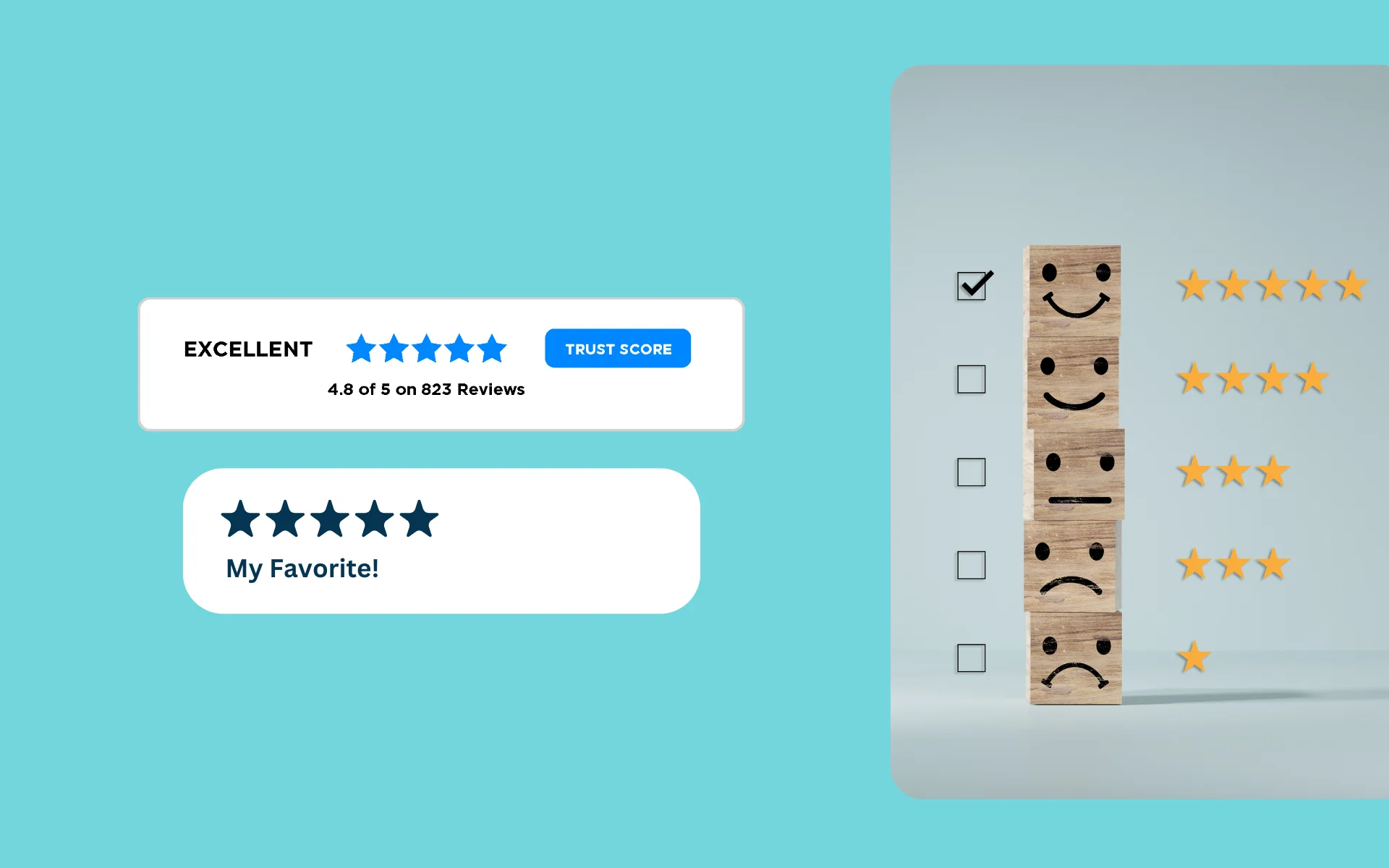
Boost your average star rating with these 10 proven strategies. Learn how to improve product quality, request reviews at the right time, respond to feedback, and build customer trust.

Learn how AI-powered tools can analyze customer feedback in seconds, identifying key trends, recurring complaints, and actionable insights to improve your ecommerce business.
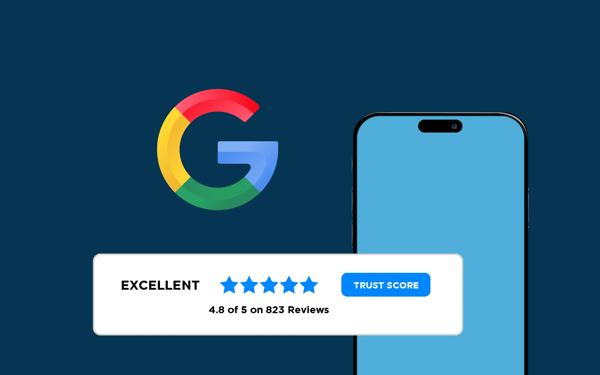
Discover 7 proven strategies to increase Google reviews and boost your star rating, from conversational review requests to gamification tactics that drive authentic feedback.
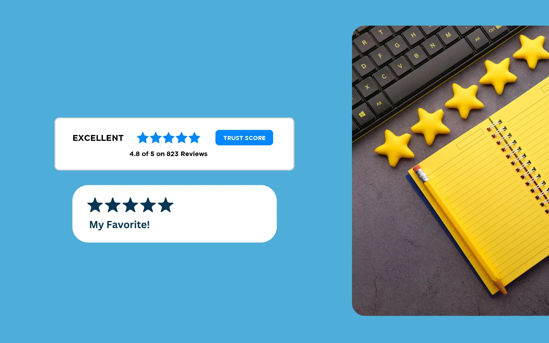
Follow this comprehensive blueprint to reach and maintain a 4.5-star rating through strategic review management, customer experience improvements, and data-driven optimization.

Transform customer reviews into compelling ad copy that drives conversions. Learn how to find the best reviews, structure them effectively, and optimize for different ad platforms.
Showing 1–12 of 81 articles
Page 1 of 7